
Logo, CD Digipak & Disc Face
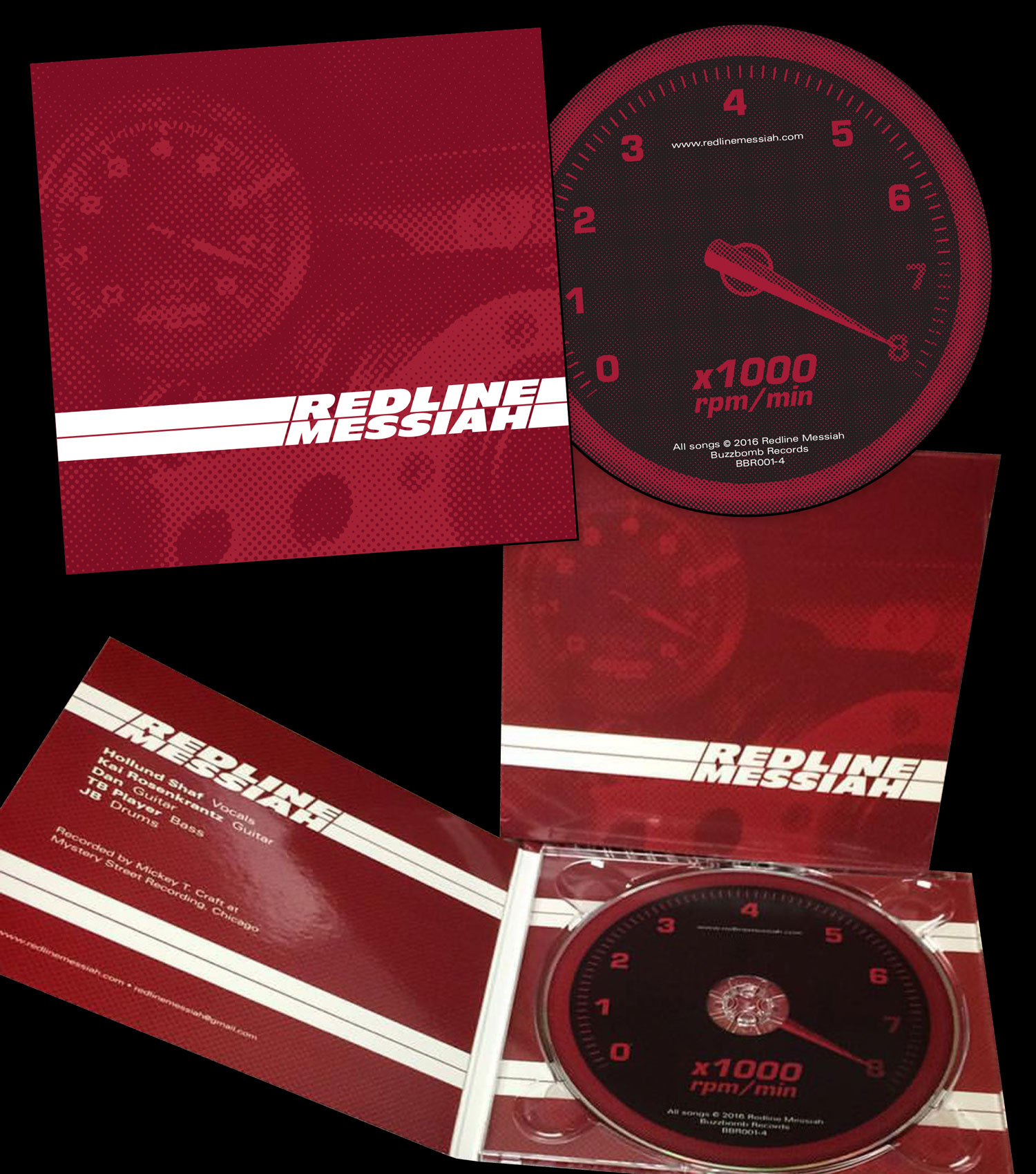
For the logo, I drew inspiration from performance motor parts brands of the 1970s. This feel continued through the cover and CD face design. I devised the concept of a race car dash with the tachometer almost pegged, playing off the band name,
and added a loose line-screen in the image to enhance the vintage feel. The line-screen and racing stripes continue through on all panels of the case to give it more depth and texture than a flat red field would have.